2014–2016 Interaction designer
Quedro CRM, developed by Quedro, is a platform that helps real estate agents with their everyday tasks offering automation in their communications and improving the relationship with their customers. The application is a powerful tool that can be used to analyze and follow-up the market, and hence to succeed in the business.
In order to comply with a non-disclosure agreement, I have omitted confidential information in this case study. The content presented is based on information available to the public. The approach explained is my own interpretation of common process frameworks and does not reveal any confidential procedures.
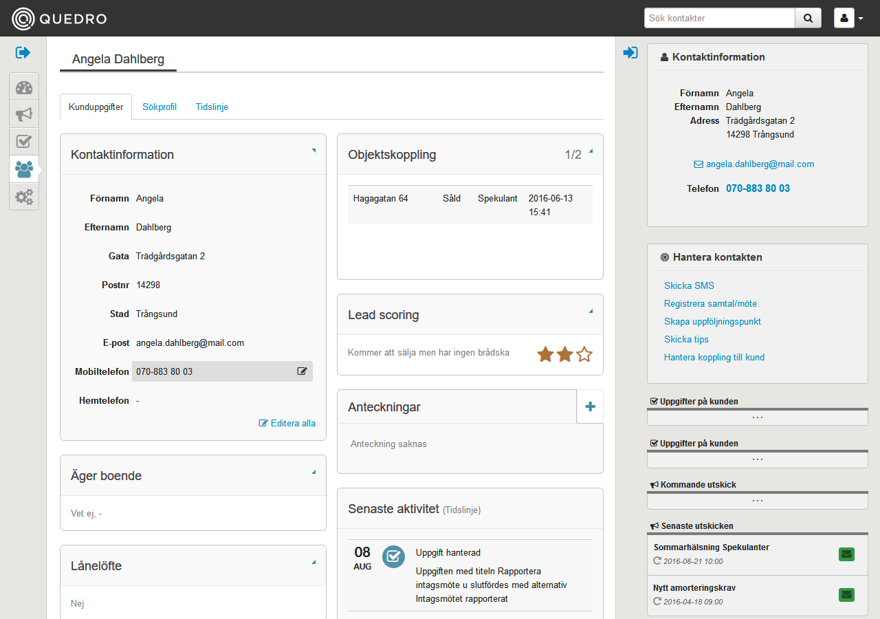
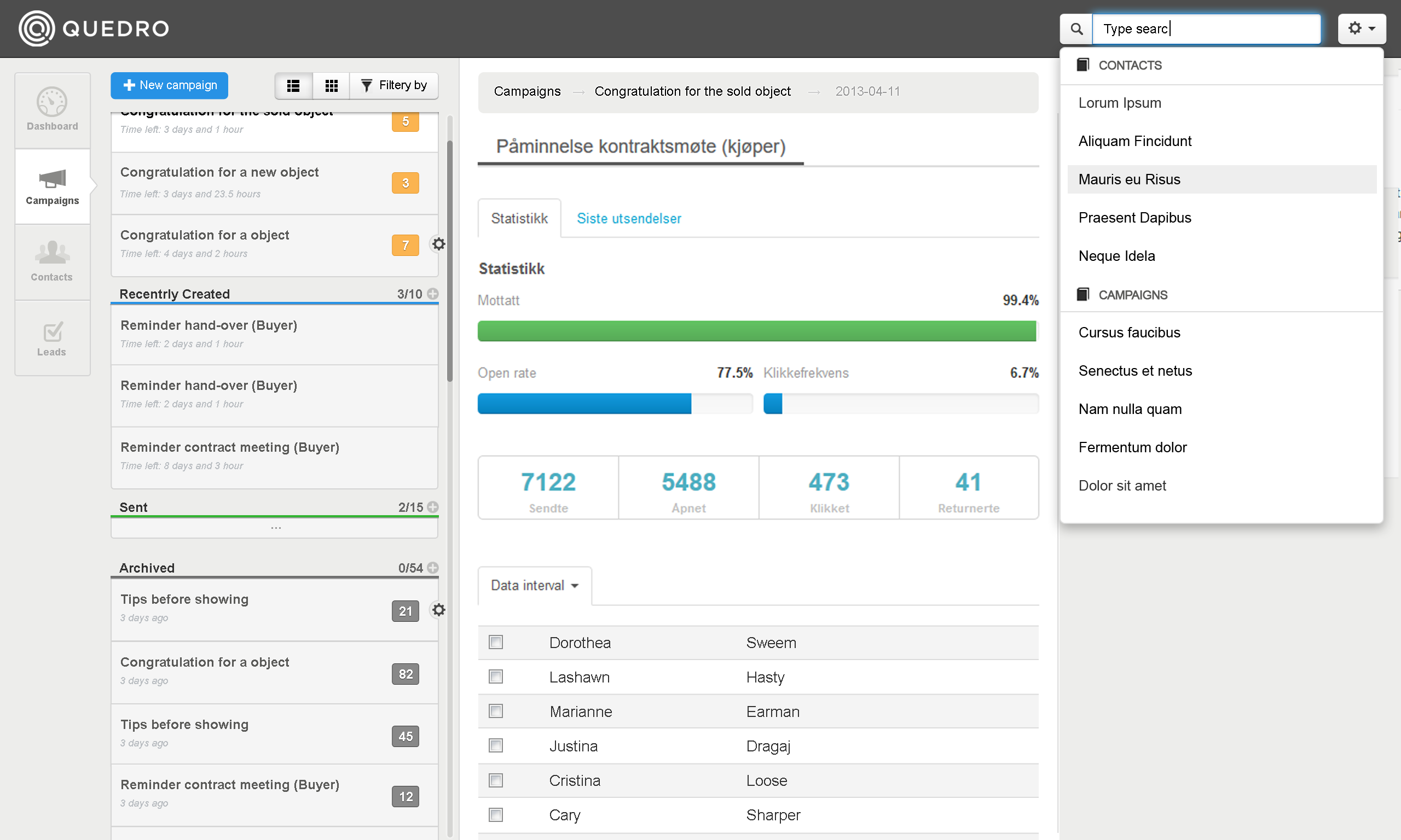
Overview of the customer relationship management.
I designed the user interface and implemented a front-end framework for a modular, responsive and modern CRM (customer relationship management) web desktop application for Realtors. Since the project started in April 2013, I worked in close collaboration with the project management, project owner, front-end and back-end team in an agile environment.
When new members joined the front-end team I was responsible for introducing them to the framework functionality. At the time of expanding the platform I delivered sketches and prototypes. During this three-year project I produced HTML5/CSS3/JavaScript implementations and I worked as an interaction and user interface designer.
On the beginning of 2013, the management defined the specifications for a new and exclusive CRM for Realtors. The vision of Quedro CRM was:
To be the best CRM application for Real Estate Agencies in the Nordic countries.
The definition of this new platform was based on extensive experience in the sector as well as direct contact with the agents, the future end-user. The specifications included general functionality and user stories, which helped the team to understand the problem in an appropriate way.
The goal was to design a powerful tool to help the agents manage their contacts effectively and to improve their business opportunities. The platform should include customer follow-up, automated communication between agents and their clients and handling of leads (prospective consumers that showed interest and provided contact information).
In order to promote a collaborative work environment for the front-end implementation we selected a responsive framework which fulfilled the following requirements: intuitive for fast and easy development, integrated by a large user interface base and a fluid grid system, and supported by modern desktop and tablet browsers.
After three years working in mobile web development, this project challenged me to update my knowledge about desktop UI design and browser compatibility.
In order to find the optimal solution, first the team needed to understand the problem. In the initial phase of the project, I defined the following design strategy, which we applied in the implementation of the platform.
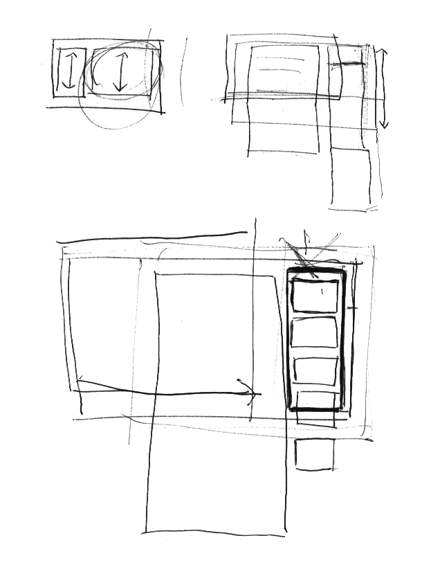
To begin with, the specifications were analyzed and discussed with the project manager. When the application’s goals were set I started sketching the application. Some of the parts I took into consideration were the main structure and navigation as well as requested features.
The goal of these quick sketches was to visually communicate abstract concepts with team members so as to retrieve feedback and to define the application wireframe.
What followed was the translation of those paper sketches into more detailed digital mock-ups. I implemented each view with at least two alternatives in order to bring them to the feedback meetings where we selected the best variation.
Interface alternatives.
Based on reactions and feedback received by team members, I rendered the mock-ups into interactive HTML prototypes. At this stage the graphics were not prioritized: the goal of the prototypes was to verify if the assumptions in the navigation were correct and solved design requirements.
The next step in the process was to produce high fidelity mock-ups and to deliver them to the stakeholders. During this stage we must pay attention to every detail. I created pixel-perfect visual graphics, applying product branding, grid structure, color palette and icons.
Photoshop pixel perfect mock-up.
Once the project manager and a selected group of users were satisfied with the proposed solution, we implemented the high fidelity mock-ups into HTML5/CSS3/JavaScript using the front-end framework selected in an early stage of the project as the main resource.
During the entire design process, it was important to seek feedback and to have several iterations. This strategy helped to communicate design decisions and gain alignment within the team members and stakeholders throughout the process. It was an effective way of unifying the system and delivering consistency across each feature in the platform.
At the end of the summer of 2013, the first functionality of Quedro CRM was released. The delivery included a communication module that gave the real estate central office the possibility of making segmentation lists which were then used to send newsletters to their target customers. The agents in the whole chain had access to advanced tools to personalize the messages before they were sent to their customers.
At the time when new developers joined the front-end team I introduced them to the design process used in early stage of the project. In the last two years we have worked in an agile environment and the process framework has evolved; once the priorities and goals were set by the project manager and the project owner, the scrum team worked in continuous delivery sprints to implement new features into the web application. I contributed to the project producing web implementations and, when new major functionality was requested, I worked as an interaction and user interface designer, delivering sketches and prototypes.
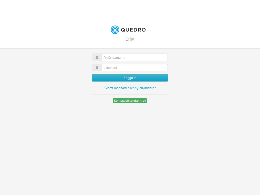
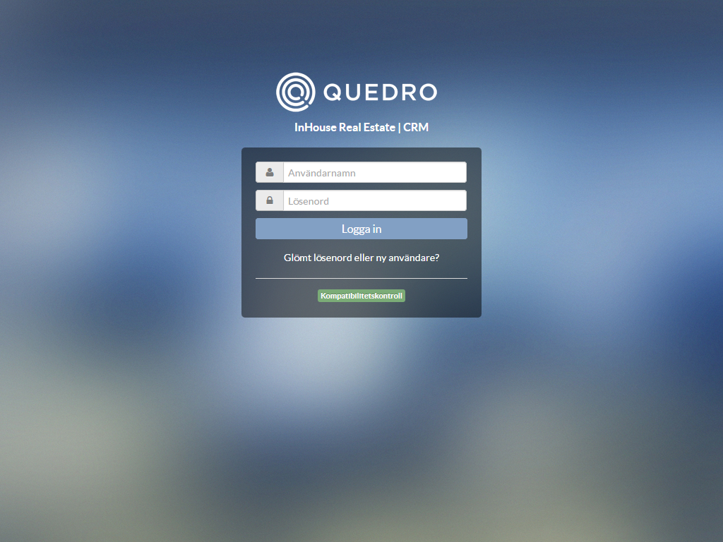
Evolution of the Login page.
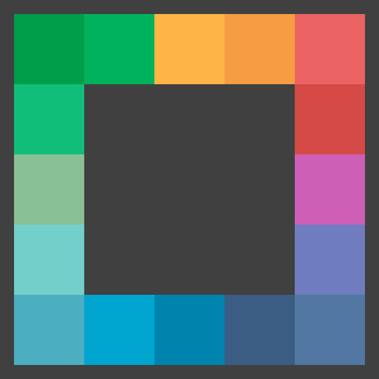
As the team grew, the challenge has been to keep a consistent base code and visual appearance of the application. Both code and visual guidelines have been created. One example of this guideline is the color palette and icon resources used across the application. A distinct icon and color was assigned to each module in the platform to help the user to associate concepts and work in a more productive way.
During the last three years after the launch, Quedro CRM has evolved and adapted to the user. The company’s client portfolio has grown, by the end of 2016 more than 1,500 agents from six agencies in Sweden and Norway used the application daily. Based on the requirements of our clients and on user research, new functionality has been added to the platform. We used support tools to get in touch with the users, we created a list of customer pain points and we mapped the user experience. We took the negative feedback in consideration for further improvements and the positive to state that the product met the needs of our users.
Average of 1,500 users per day.
Working in this project I learned that the focus should lie on understanding the user’s problem. Unfortunately, in this particular project, it was not always possible for me to reach the user. Although I could rely only on information provided by the project manager, I found other ways to learn about the user’s needs, for instance, by studying analytics and allowing the user to easily send support queries through the application. I also learned that my passion is to design the interaction and to enhance the overall experience of the user.
2011–2013 designer
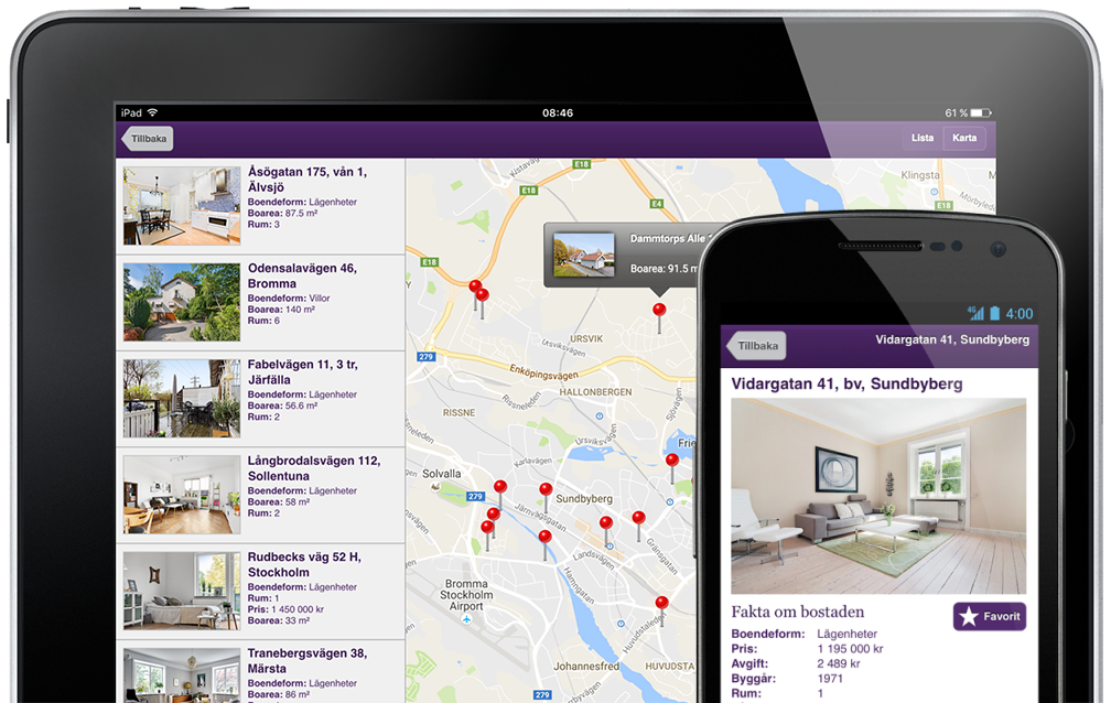
Standard Solution is a mobile web application that makes finding homes for sale an easy and satisfying experience.