Case study:
Reshaping the user experience of a foreign exchange platform
- 2017–2019
- designer
- Design System
- UI Design
Aphelion eFX is a foreign exchange trading platform used by banks, investors, and funds to trade currencies electronically across the global financial market.
By 2017, years of added functionality had made the platform powerful, but increasingly complex. Parts of the experience had become harder to understand, configure, and operate. The company wanted to provide customers with a better UX/UI and make the product more attractive to prospects evaluating the platform. As the only designer on the project, I was responsible for defining how to approach that ambition.
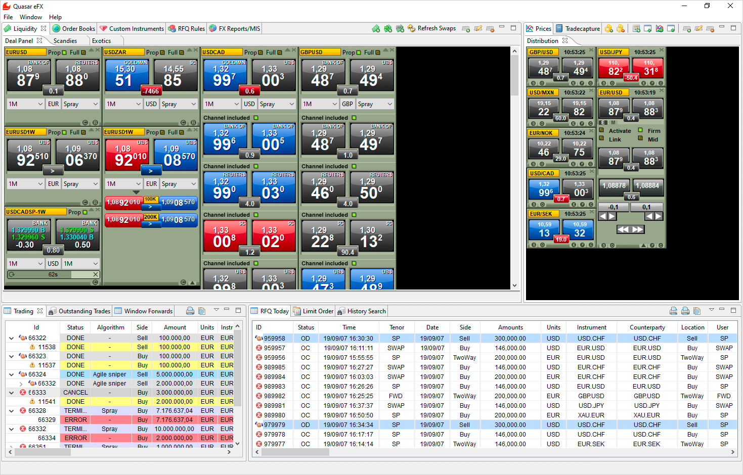
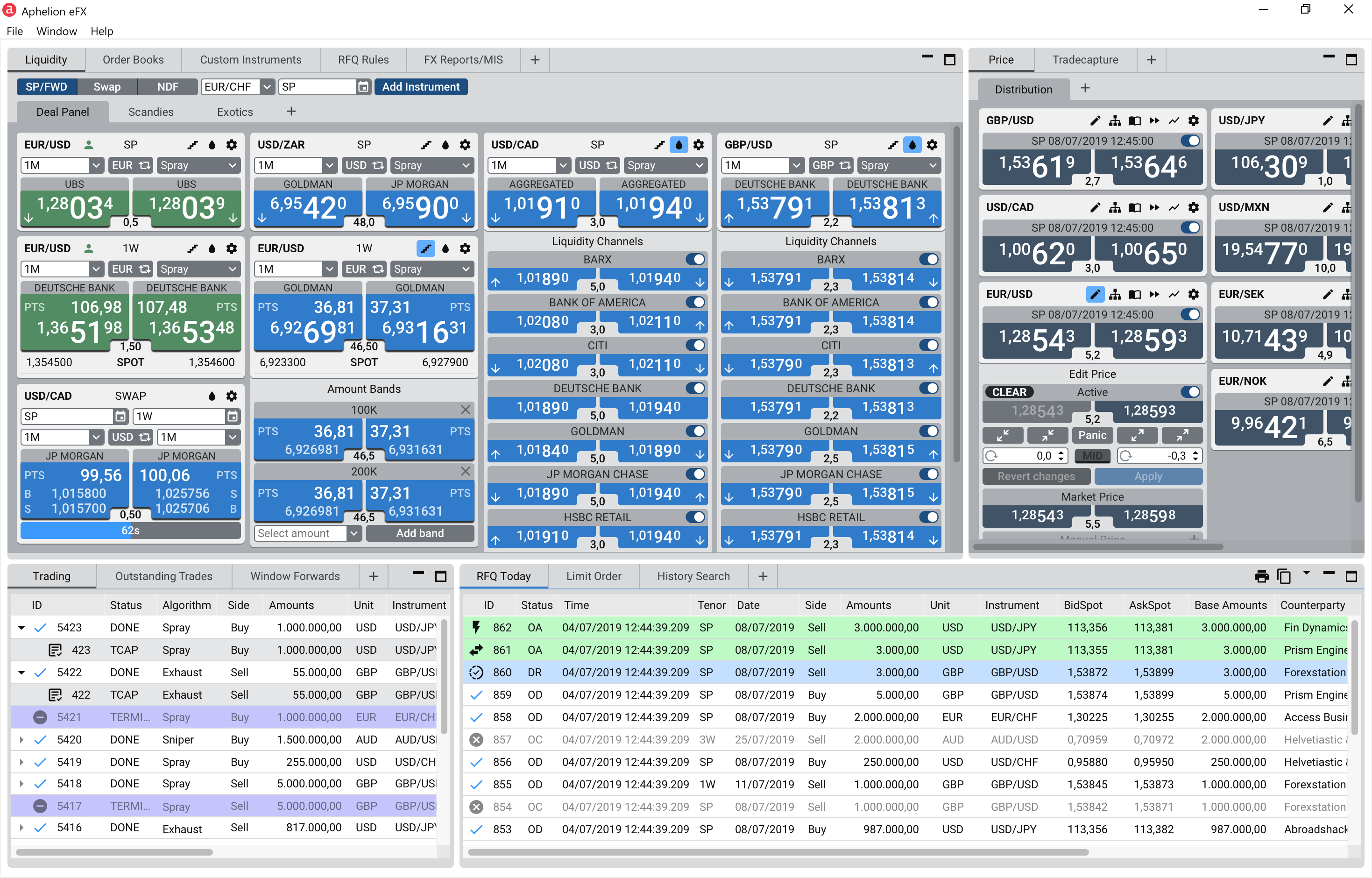
FX platform application before and after the redesign.
My role
I led the UX work end to end, defining the approach, analysing the existing product, researching user needs, identifying usability issues, and translating findings into design concepts, reusable UI components, and implementation-ready specifications. I collaborated with management, customer service, product stakeholders, and software engineers to connect user insights with product decisions and support the redesign through delivery.
Discovery
Validating assumptions through user research
The initial ask was to improve the UX and UI of the platform. I started with a UX audit and competitor review to identify assumptions that needed validation through user research.
Working with colleagues from Customer Service, I recruited around 20 active users and met them in individual research sessions.
The goal was to understand how different users worked with the platform. Those sessions revealed what was working well, where users struggled, and which problems were difficult to see from an internal perspective.
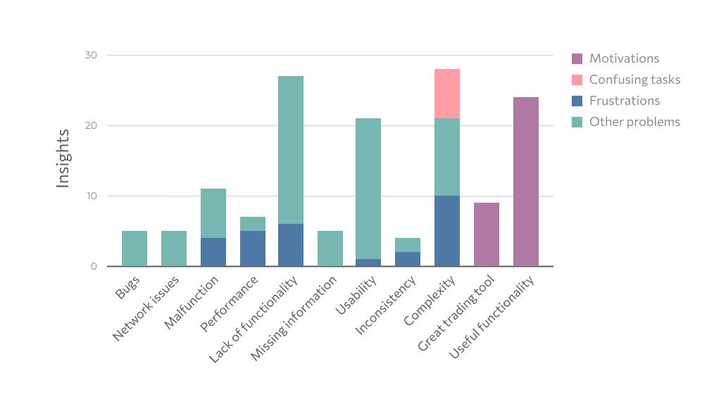
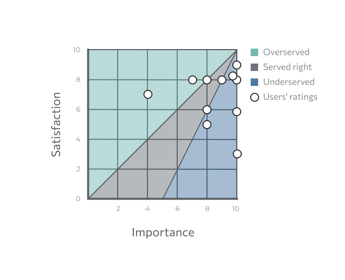
To support prioritisation, I mapped user feedback against satisfaction and importance. This helped prioritise features that were heavily used but frustrating, areas that were important but underserved, and lower-priority issues, moving the project from opinion-based discussions towards a more evidence-based understanding of the user experience.
Execution
Translating insights into design direction
The findings showed that the redesign could not be limited to making the interface look more modern. The platform also needed clearer interaction patterns, stronger visual hierarchy, more consistent components, and better support for dense financial data.
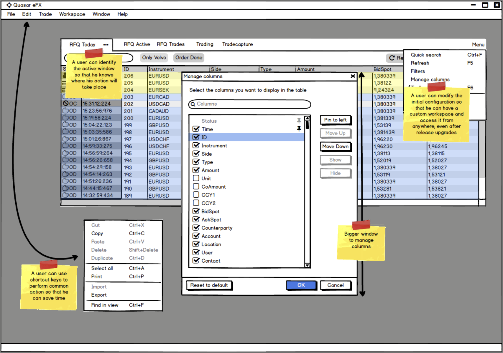
Mock-ups featuring improvements.
I explored improvements through mockups and prototypes, focusing on how specific workflows could become clearer without disrupting the familiarity users needed in a trading environment. The design had to support experienced users who relied on speed, precision, and control, while making complex functionality easier to understand and operate.
Creating a scalable interface foundation
Enterprise trading applications are dense by nature. For that reason, readability, hierarchy, and consistency were central to the redesign.
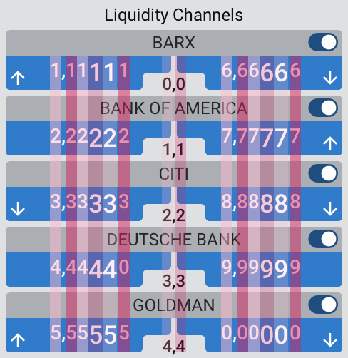
Font with a consistent width for the digits.
I created reusable UI components in Sketch and organised them into a shared library, establishing the basis of a design system for the platform. This helped maintain consistency across the product and made it easier to update interface elements as the redesign evolved.
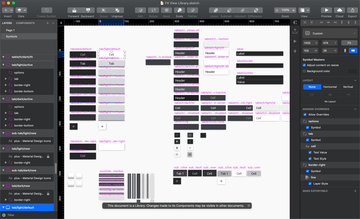
Organised UI components into a shared library.
The visual direction focused on reducing unnecessary noise while preserving the information density required by users. I used spacing, contrast, typography, and selective use of colour to structure the interface and highlight important data.
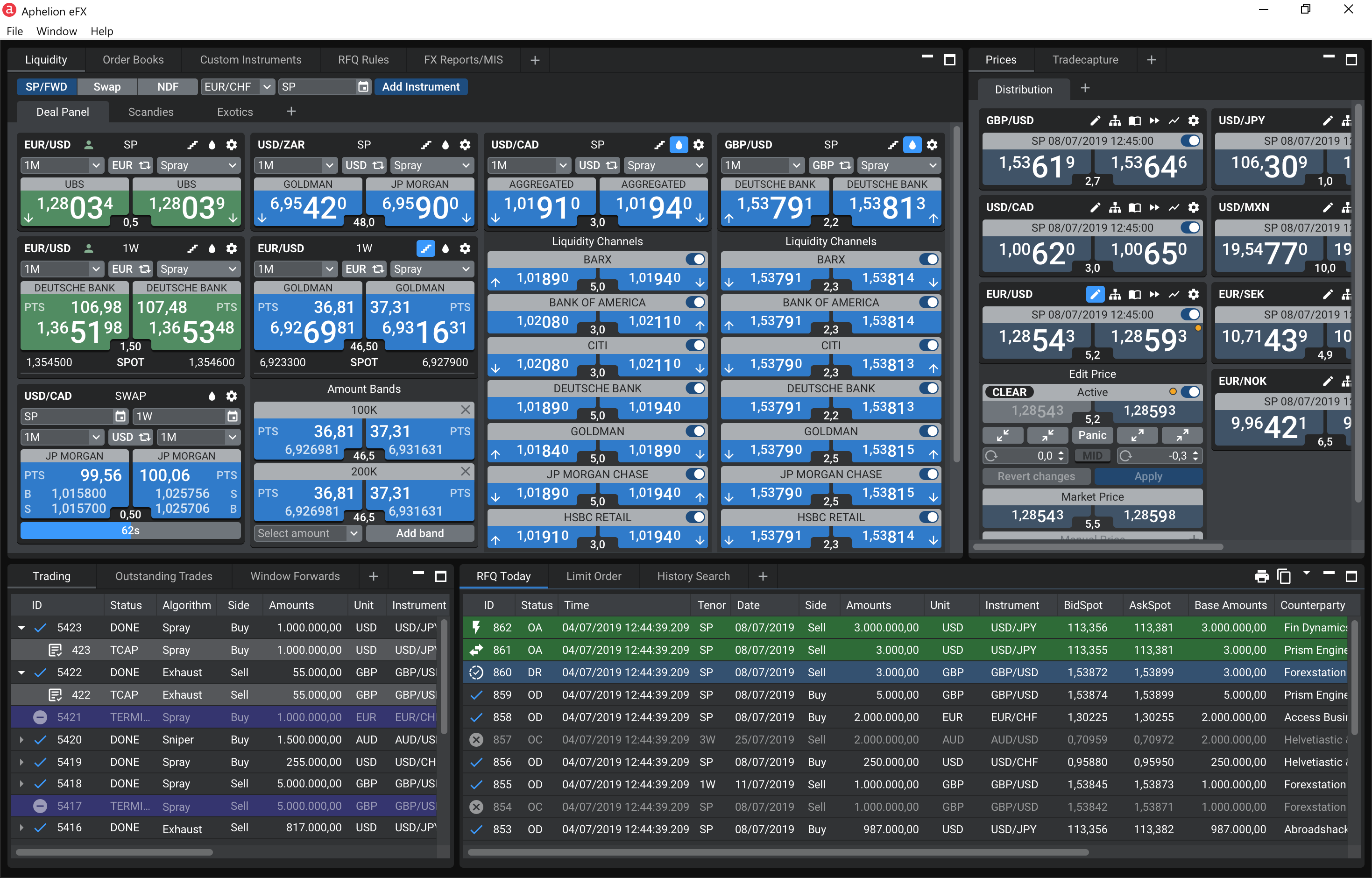
Light and dark modes for the redesigned FX platform.
Colour was treated as a functional design element rather than decoration. I developed a palette that supported both the default light interface and a darker mode, responding to early user feedback and the needs of users working in different visual environments.
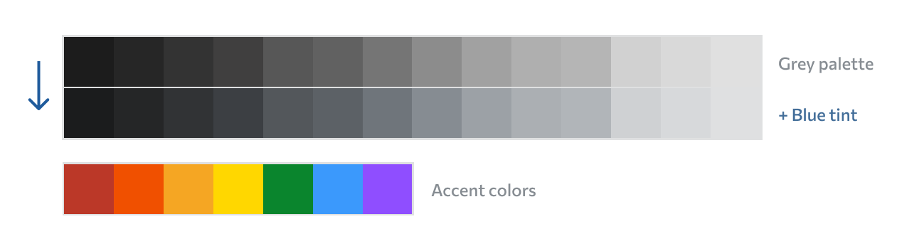
A blue tint was added to the grey palette.
Accessibility considerations were included in the visual design work. I checked contrast ratios for text and key interface elements and reviewed how colours would be perceived by users with different types of colour vision deficiency.
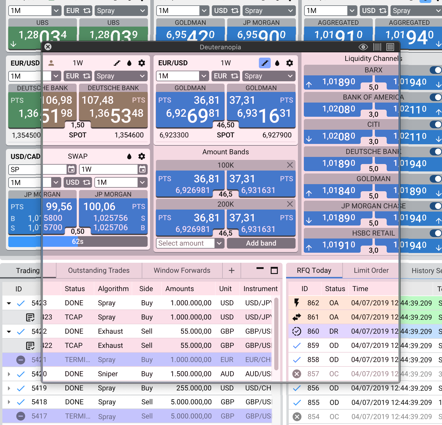
Colour blindness checker.
Supporting implementation
To support implementation, I documented the functional design and the user experience rationale behind key design decisions.
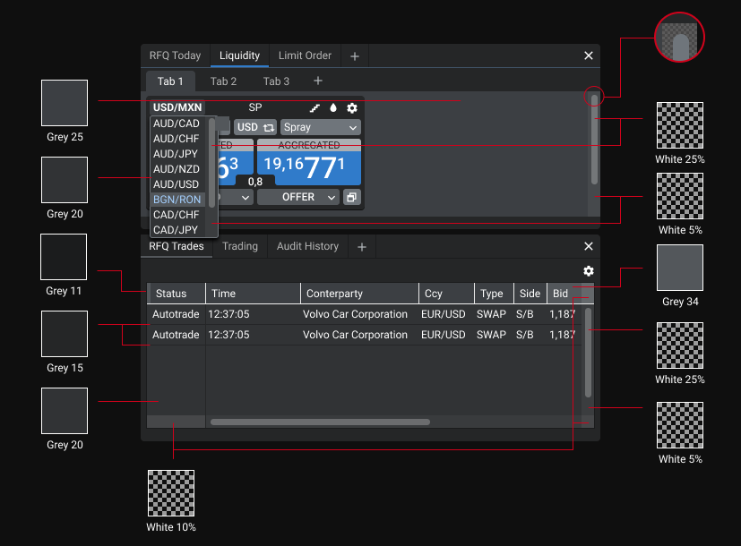
Handoff specification.
During implementation, I worked closely with the development team to answer questions, review details, and adjust solutions when technical constraints required a more pragmatic approach.
Outcomes and reflection
The redesigned interface was implemented between 2018 and early 2019, and started shipping to customers by mid-2019.
The project delivered a more modern, consistent, and usable experience for the FX platform. Through the redesign, I introduced clearer visual hierarchy, reusable UI patterns, improved readability for dense financial data, support for light and dark modes, and a stronger foundation for future product improvements.
Beyond the interface itself, the project helped bring user-centred thinking into the organisation. Research gave the team a clearer understanding of customer needs, user archetypes helped frame product discussions, and prioritisation helped connect design decisions to user value.
As an end-to-end UX project for a complex enterprise product, this work became an important step in shaping my approach to research-led design.