Case Study:
Reshaping the UX of Quasar eFX
2017–2019 designer
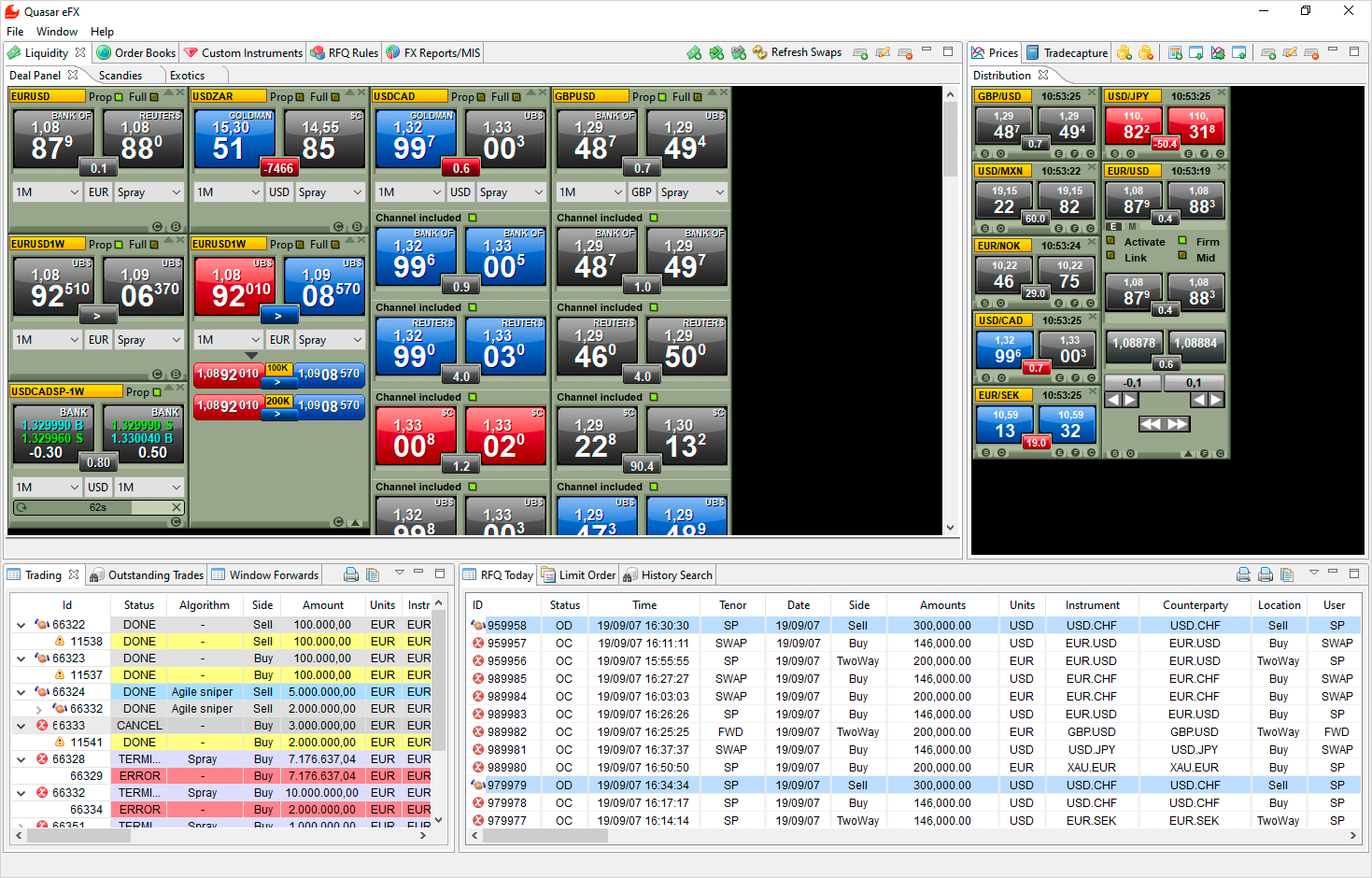
In 2006, a team of Foreign Exchange specialists founded Aphelion and with their expertise in the forex industry they created Quasar eFX. The software revolutionised the ability for banks, investors and funds to trade currencies electronically on the global financial market.
By mid-2017, the usability and overall experience of the application was affected by an overload of features that in many cases were confusing and complicated to operate. The company was committed to offer an enhanced experience to Quasar eFX customers and become more attractive to prospects that were considering purchasing the product. In order to bring the product to a new level, it was my responsibility to take ownership of the application user experience and to modernise the graphical user interface of one of the most competitive electronic tools in the FX industry.
In order to comply with a non-disclosure agreement, I have omitted confidential information in this case study. The content presented is based on information available to the public and does not reveal any confidential procedures.
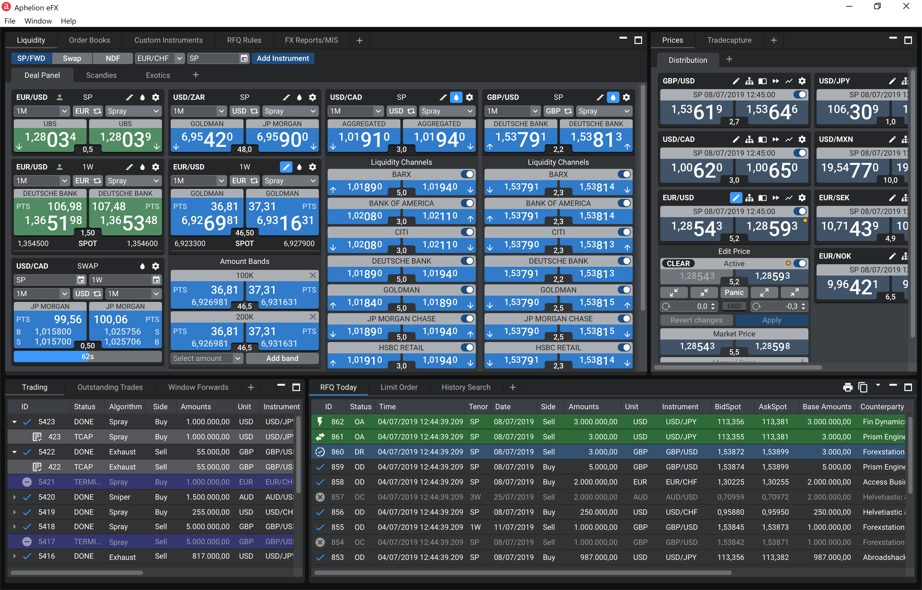
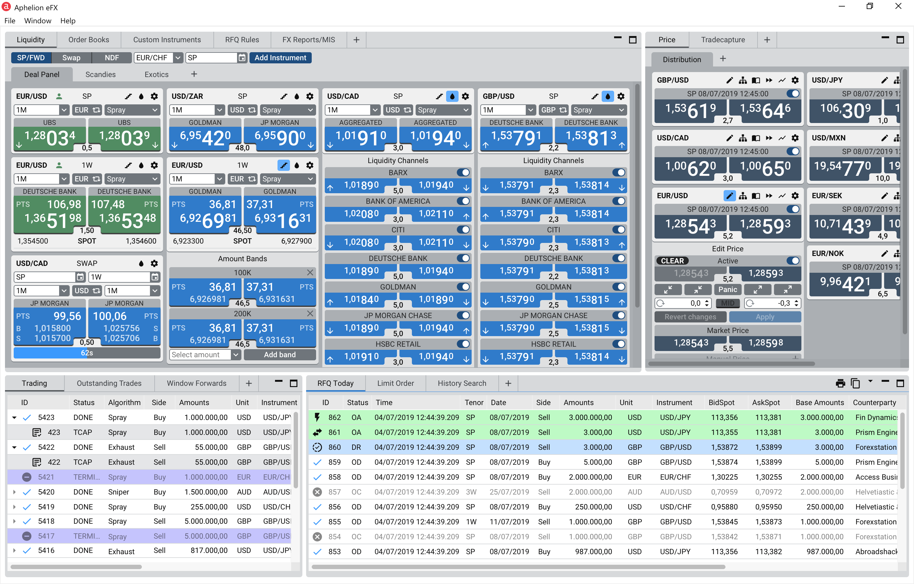
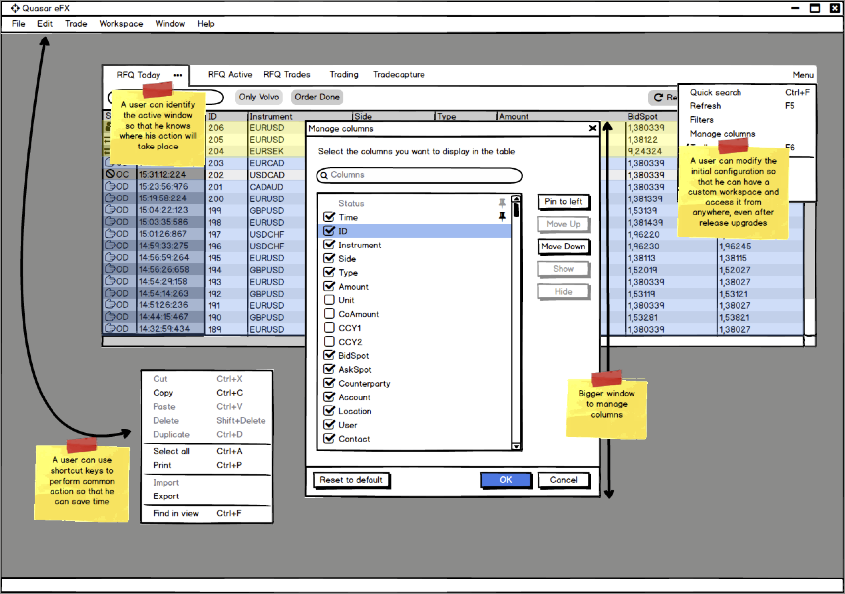
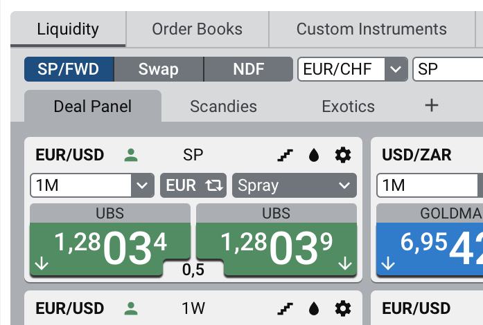
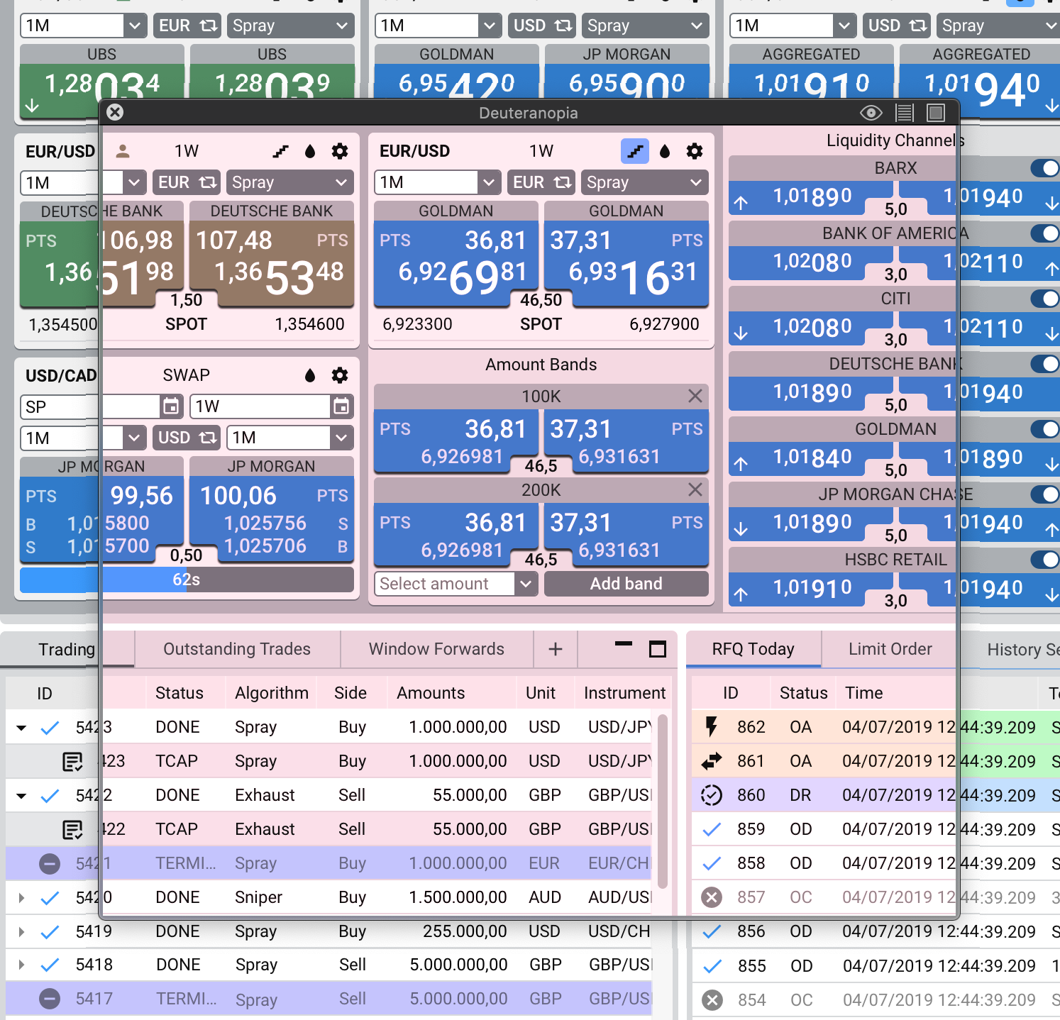
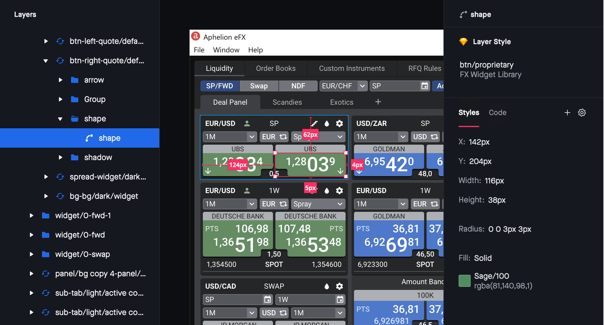
Overview of Quasar eFX after the redesign.