Fidessa has long been a cornerstone in the Fintech industry, offering a comprehensive platform that allows users to manage the entire order and trade lifecycle from a powerful desktop application.
For years, customers have requested an alternative lightweight solution that enables traders to access critical workflows on the go. In response, I designed and led the development of a mobile application that brought efficiency and simplicity to complex trading workflows.
In order to comply with a non-disclosure agreement, I have omitted confidential information in this case study. The content presented is based on information available to the public and does not reveal any confidential procedures.
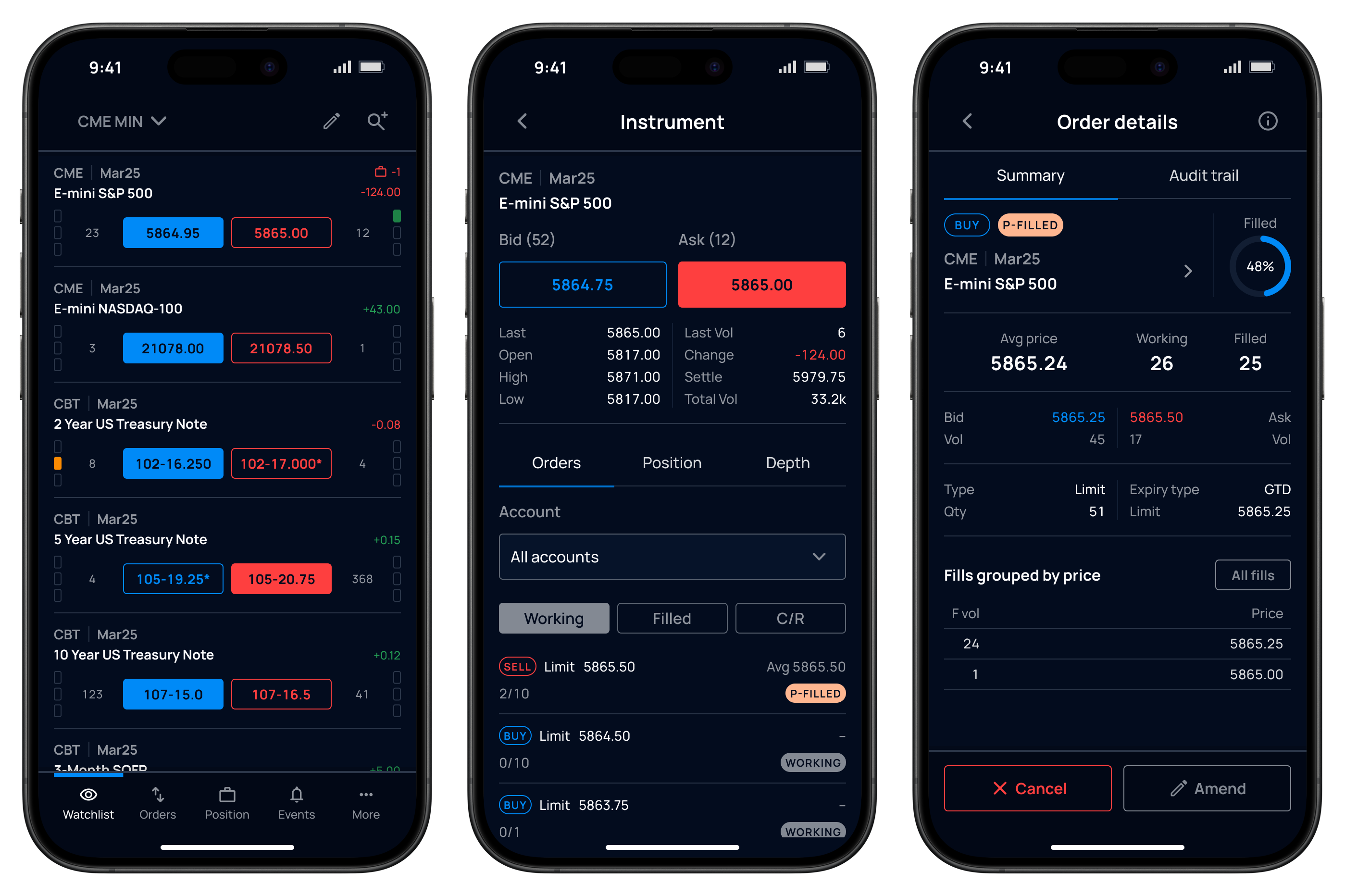
Hi-fidelity screens of the fintech mobile app.
As Lead User Experience Architect, I helped shape the product vision, prioritized features with the Product Manager, designed and validated key workflows through prototyping and user testing, and collaborated with engineering teams to bring the product to market. I also partnered with the Design System team and other product teams to establish mobile patterns and ensure consistency across the product portfolio.
The objective was to bring the most critical trading workflows from a complex desktop platform to mobile, enabling traders to manage orders and monitor markets from anywhere.
The project also helped define reusable mobile patterns for the company’s design system, creating alignment with other mobile products across the portfolio.
The desktop application was a large Windows-based trading platform with dozens of screens and functions supporting the full trading lifecycle. The challenge was not simply to make it smaller, but to identify which workflows were essential in a mobile context.
I started by auditing the desktop application with subject matter experts to understand the workflows, screens, and data points traders relied on most. Together with the Product Manager, I prioritized the highest-value trading workflows and helped define a roadmap for the first release.
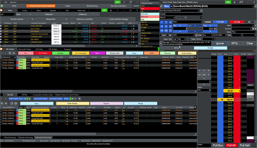
Existing desktop platform used to inform the mobile product strategy.
The company’s design system was primarily built around desktop products and lacked established mobile patterns. As part of this project, I worked with the Design System team to define mobile navigation, layout, and interaction patterns that could be reused across future mobile applications.
Navigation and transitions prototype.
High-fidelity prototypes were used to validate whether the mobile experience could present dense trading information without feeling cramped or difficult to navigate.
Across two client feedback sessions with eight participants in total, we tested key workflows and gathered feedback on information density, navigation, and clarity. The response was positive: users felt the interface remained clean and easy to read, despite the amount of information shown.
"It was a very nice experience, (…) even though screens are filled up with information they are very clean, easy to read and navigate."
— User testing participant.
The sessions also revealed opportunities to improve some screens. Users expected to see additional market information in specific places, so I iterated on the design to surface more relevant details while preserving readability. These sessions helped validate that the product was moving in the right direction ahead of launch.
The application relied on multiple backend services, some of which could become temporarily unavailable or return incomplete data. Rather than exposing technical errors to users, I designed patterns that clearly communicated what had happened, what information was affected, and what actions users could take next.
The goal was to make failures understandable and recoverable, helping users maintain confidence in the platform even when parts of the system were unavailable.
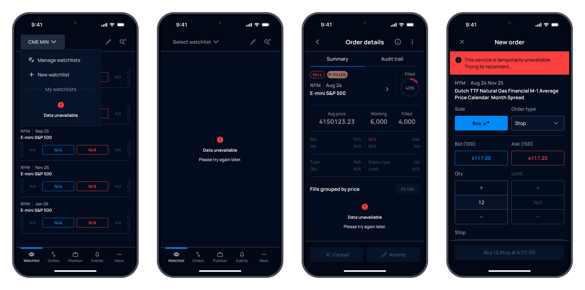
Error information and recovery.
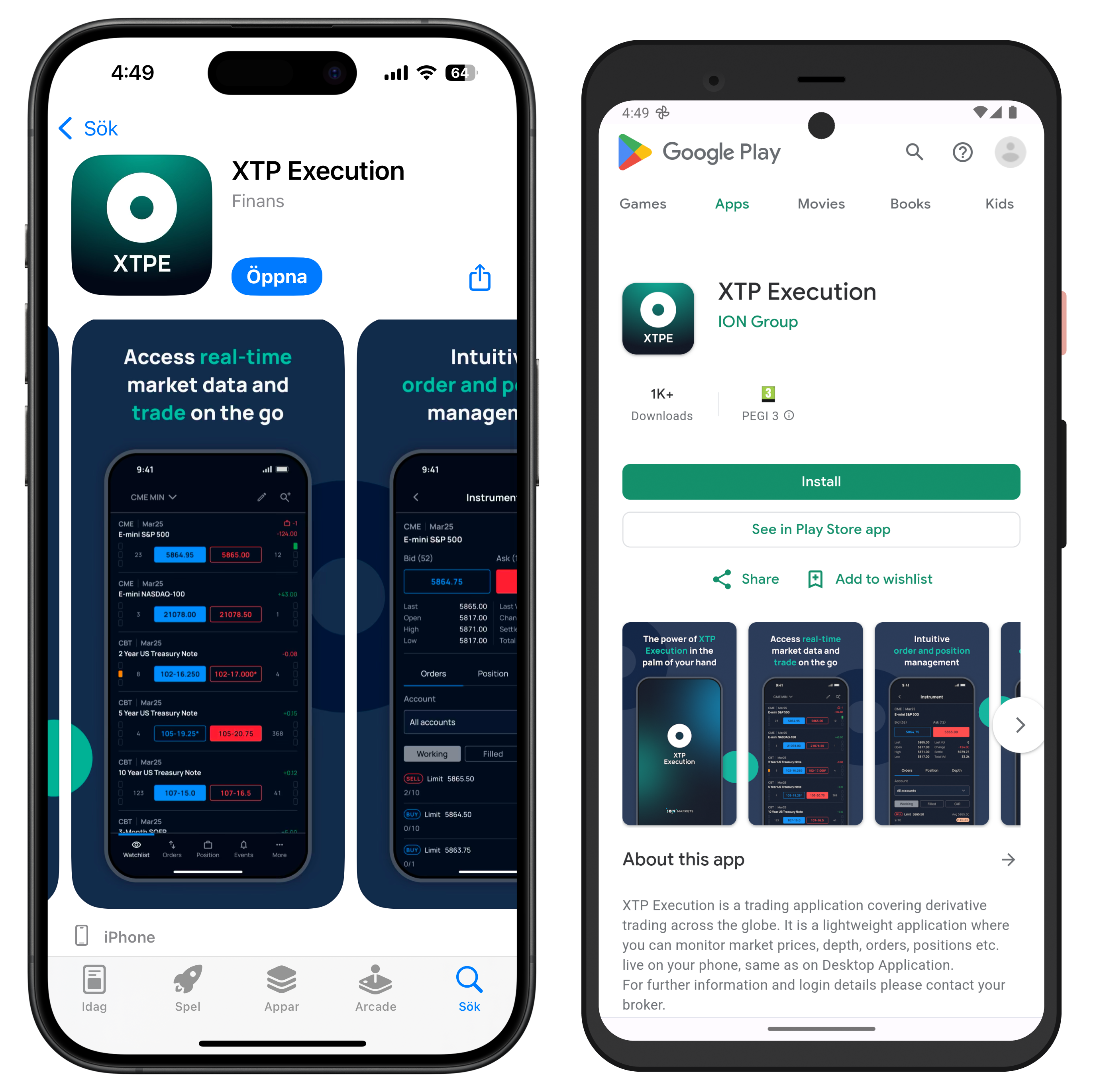
I successfully designed and led the implementation of a mobile trading solution that brings an intuitive and engaging user experience for traders who need to access critical workflows on the go. Built on web technologies, this cost-effective solution enhances efficiency and simplicity for customers, enabling them to access over 200 global trading markets, 600 brokers, and connectivity worldwide with 6,500 buy-side accounts.
Releasing a Cleared Derivatives mobile application on the market also gave the company a competitive edge, attracting new clients who value innovation and require mobile access to global trading markets.
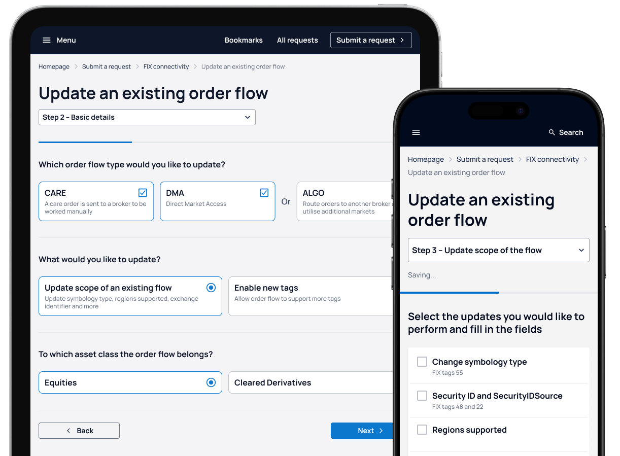
Helping customers navigate a complex setup process with clearer guidance, greater control, and faster time to value.
The following content may contain the trade names or trademarks of various third parties, and if so, any such use is solely for illustrative purposes only. All product and company names are trademarks™ or registered® trademarks of their respective holders. Use of them does not imply any affiliation with, endorsement by, or association of any kind between them and this site.