Case study:

Improving operational efficiency through a support portal redesign

  • Nov 2021–Apr 2022
  • UX Architect
  • Wireframing
  • Prototyping

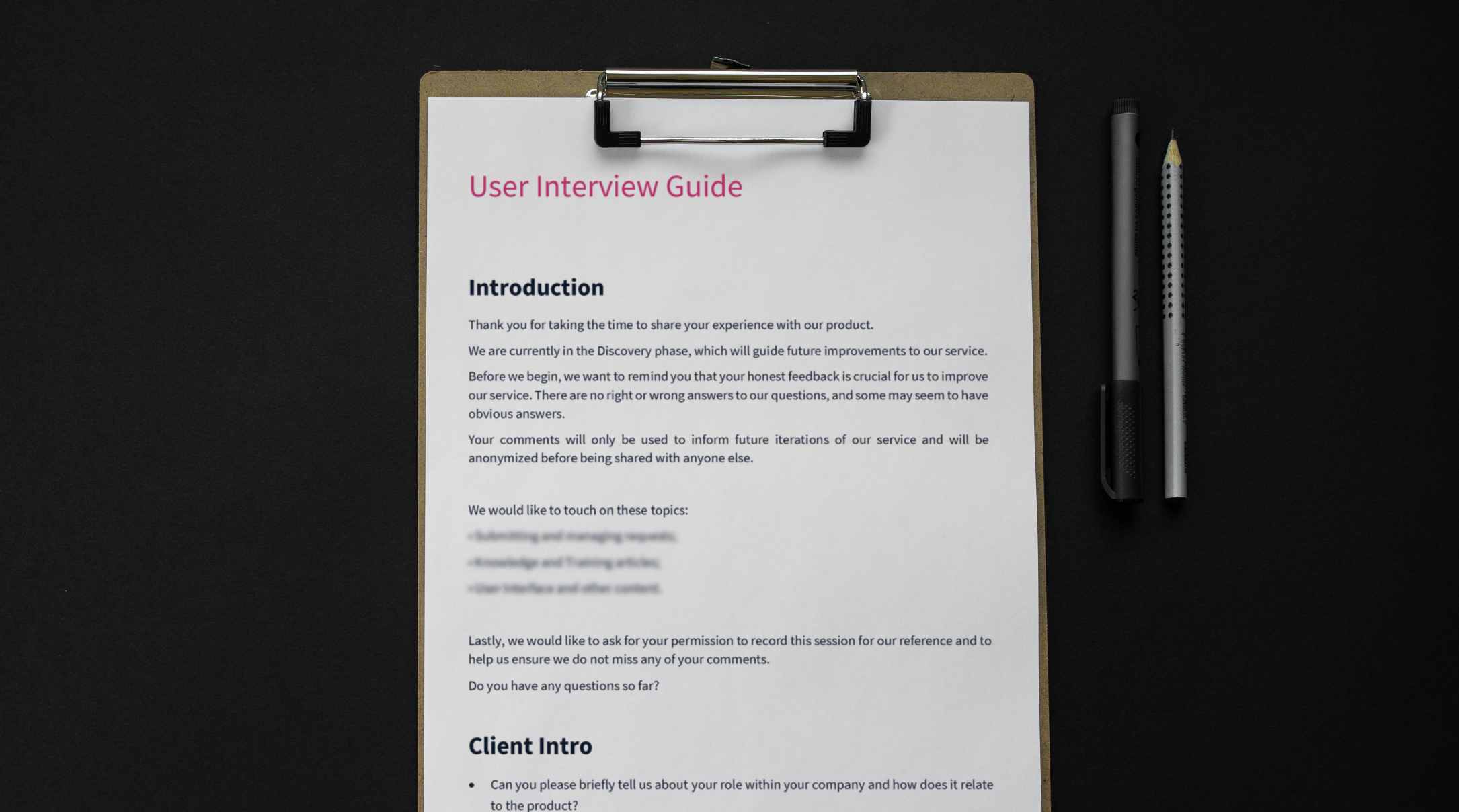
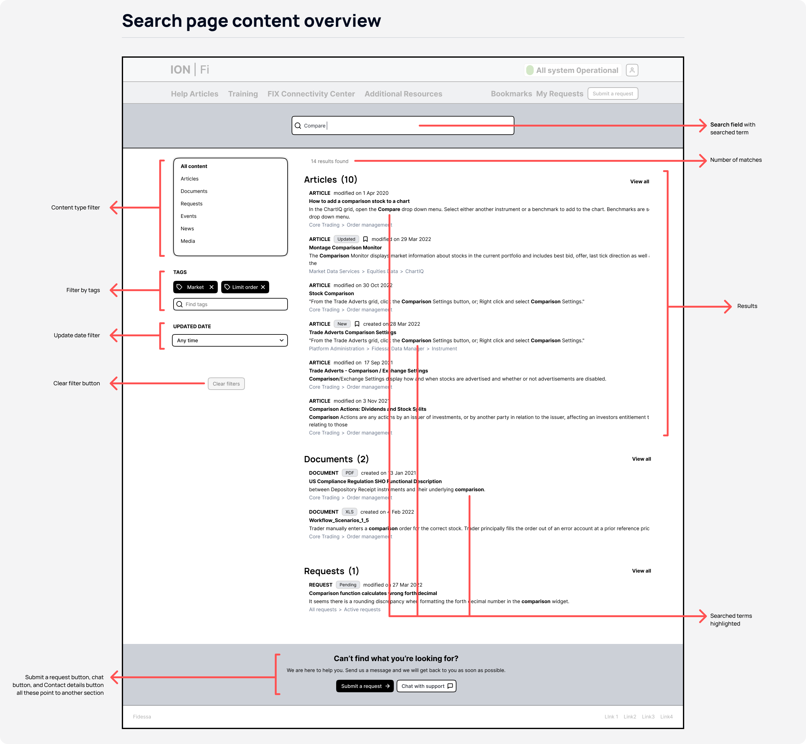
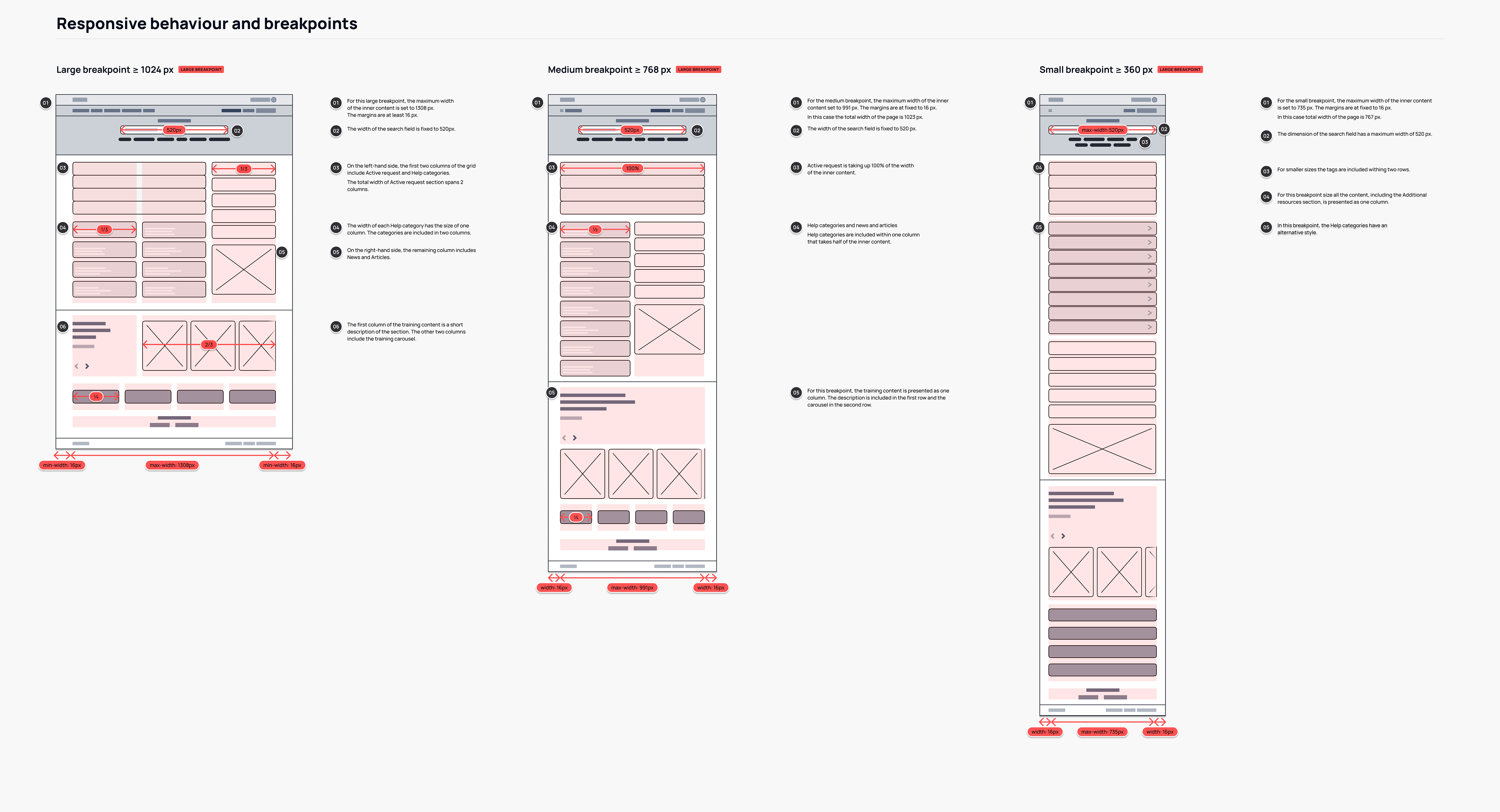
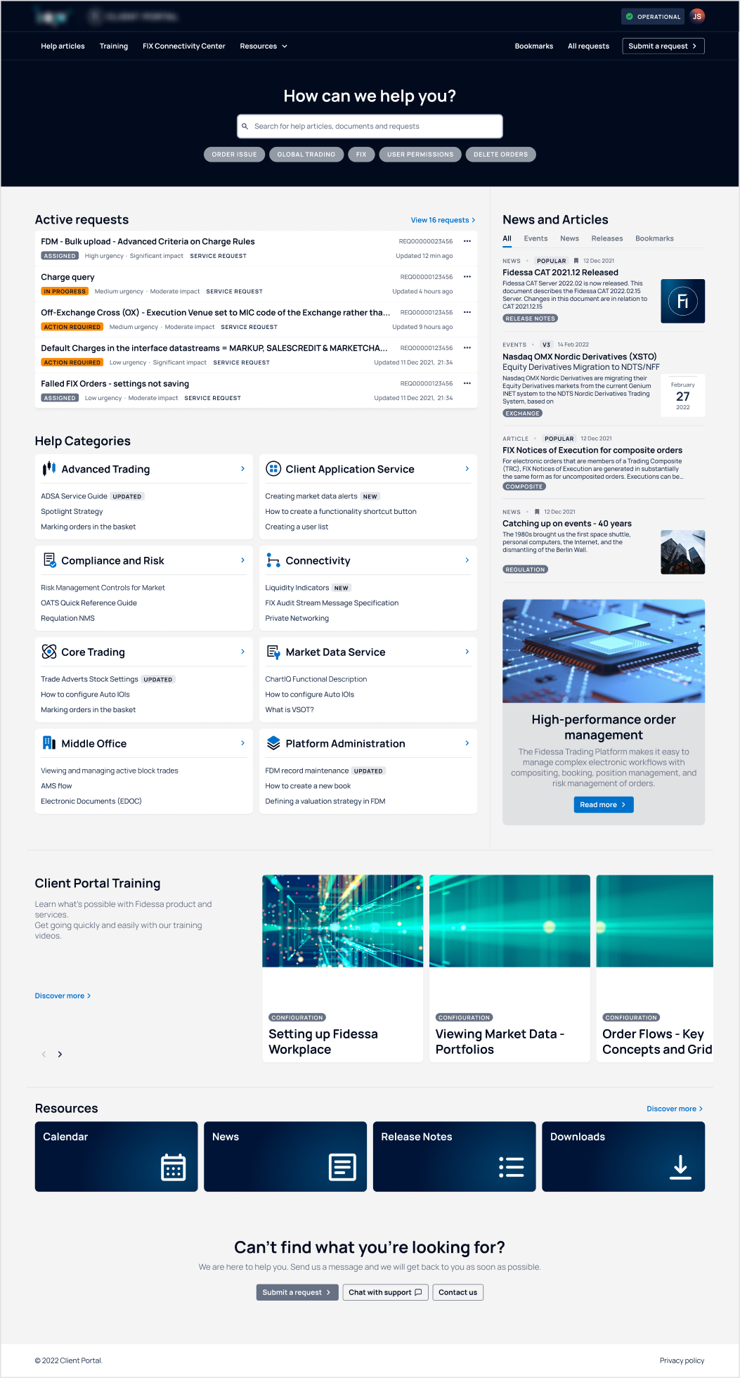
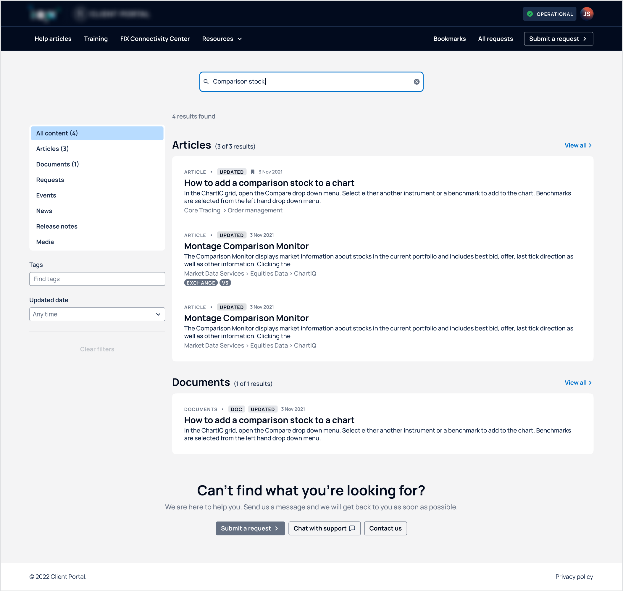
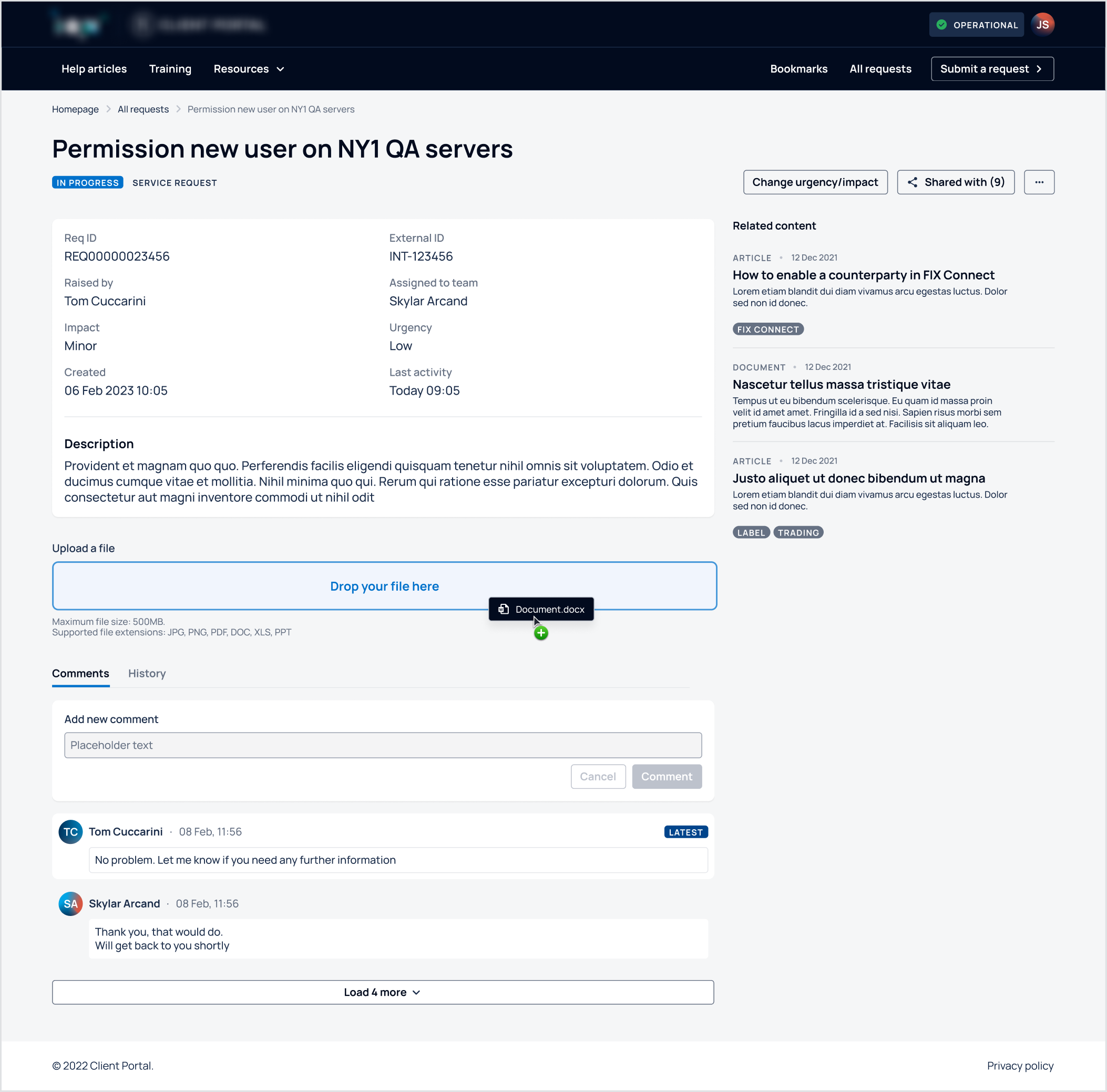
Fidessa, a provider of financial trading systems, had developed a support portal to help customers find solutions to their problems. However, many customers still relied on other support channels instead of using the portal, limiting self-service adoption and creating additional work for support teams.

The goal was to redesign the support portal experience to increase self-service adoption, improve usability, and help customers resolve issues more efficiently.

In order to comply with a non-disclosure agreement, I have omitted confidential information in this case study. The content presented is based on information available to the public and does not reveal any confidential procedures.

Portal 2021.
Portal 2022.

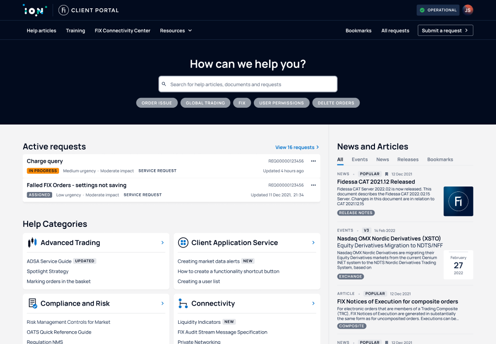
Client portal website before and after the redesign.

My role

As the Lead User Experience Architect on this project, I was responsible for translating research insights into information architecture, wireframes, prototypes, and implementation-ready design specifications.

Working closely with Product Management, Engineering, and Visual Design, I also helped shape the portal’s visual direction by reviewing design explorations and selecting the options that best supported clarity, usability, and customer expectations.


Discovery phase

Understanding the problem

One of the primary business goals for the portal was to enable customers to self-serve and find solutions to common problems.

To understand why adoption remained low, I first spoke with support teams across multiple regions. These conversations revealed a consistent pattern: customers often avoided the portal entirely and preferred other support channels instead.

This behaviour created two major challenges:

  • Customers struggled to find answers independently.
  • Support teams received incomplete requests, increasing resolution times.

Before proposing solutions, I wanted to understand why customers were avoiding the portal and what prevented them from using it more effectively.

User research

Despite pressure to move straight into UI changes, I secured stakeholder support for user research and conducted 10 customer interviews.

User Interview Guide used during the interviews.

Interview guide used to structure 10 customer interviews.


Key findings

The research uncovered several recurring themes:

  • Confusing navigation made the portal difficult to use.
  • Poor information architecture made content difficult to find.
  • Email was perceived as faster and more reliable.
  • Low confidence in search results reduced self-service adoption.

The core challenge, therefore, was to make the portal as intuitive, efficient, and reliable as email while providing the additional benefits of self-service support.

Designing the solution

These findings revealed that the problem was not visual design alone. Customers struggled to find information and lacked confidence in the portal’s structure and search experience.

To address these challenges, the redesign focused on improving discoverability, simplifying support workflows, and creating a more intuitive self-service experience.

Improved information architecture

Content was reorganised around customer goals and tasks rather than internal organisational structures, making information easier to find and navigate.

Search page with improved information architecture.

Search page with improved information architecture.

Enhanced discoverability

Search and support resources became more prominent, helping users locate relevant content and answers more quickly.

Responsive experience

The portal was redesigned to work across desktop, tablet, and mobile devices, making support accessible wherever customers needed it.

Example of design specifications for each breakpoint.

Design specifications for each breakpoint.

Modernised interface

In collaboration with the Visual Design team, we introduced a refreshed visual language that improved clarity and usability while aligning with customer expectations.

Client portal homepage.
Client portal search page. Client portal request page.

Redesigned Client portal home, search and request pages.

Outcomes

Six months after the project began, the first phase of the redesign was released to customers. Additional workflows and pages were subsequently redesigned using the same research-driven approach.

The redesign successfully addressed the key issues identified during research:

  • Portal bounce rates decreased.
  • More customers engaged with self-service support.
  • Support requests submitted through the portal increased relative to email.
  • Better structured requests improved the efficiency of support workflows.

The redesign helped reposition the portal as a more effective self-service channel, reducing reliance on other support channels and improving the experience for both customers and support teams.


Reshaping the user experience of a foreign exchange platform

  • designer
  • Design System

Modernising a complex foreign exchange platform through a scalable design system and simplified workflows.

View case study


The following content may contain the trade names or trademarks of various third parties, and if so, any such use is solely for illustrative purposes only. All product and company names are trademarks™ or registered® trademarks of their respective holders. Use of them does not imply any affiliation with, endorsement by, or association of any kind between them and this site.